
 Inobitec DICOM Viewer Lite
 Inobitec DICOM Viewer Pro
 Inobitec Web DICOM Viewer
 Inobitec DICOM Server (PACS)
1.4. Toolbar
The Toolbar is shown in Fig. 1.11 (highlighted in red).

Data source selection buttons on the toolbar:


For details on how to work with the search panel, see Section 1.7.
The button corresponding to the selected data source is displayed on a light background.
Image view buttons on the toolbar:
 | The Image viewer button opens images in the flat image view window. |
 | The Volume reconstruction button opens images in the volume reconstruction window. |
 | The MPR Reconstruction button opens images in the multiplanar reconstruction window. |
 | The Vessel analysis opens images in the Vessel Analysis window(ADD). |
 | The Coronary artery analysis opens images in the Coronary Artery Analysis window(ADD). |
 | The Cardiac analysis opens images in the Cardiac Analysis window(ADD). |
 | The Dental Imaging & Planning add-on button opens images in the dental study viewing tab(ADD). |
 | The Pulmonary Analysis Add-on button opens images in the chest viewing tab(ADD). |
 | The Virtual endoscopy button opens images in the virtual endoscopy window(PRO). |
 | The Series fusion button opens images in the series fusion window(PRO). |
 | The PET analysis button opens images in the PET Analysis window(ADD). |
 | The Show image tags button opens DICOM tags for the selected series of the selected study (see Chapter 19). |
 | The Open pdf document button opens the pdf document contained in the study in the default pdf viewer. |
 | The ECG Viewer button opens images in the ECG view window. |
 | The Report button opens the report editor window(PRO)(see Chapter 20). |
If the action corresponding to a button is not available, the button looks pale and cannot be pressed (inactive).
All the buttons in this group are made up of two parts (Fig. 1.12).

If you click on the arrow (right side of the button highlighted in green), a menu with options for displaying the information on the screen will pop up.
- display at monitor1 opens images in a new tab;
- show as detached window opens images in a separate window;
- show fullscreen opens images in the full screen mode.
To open an image in a new tab, click on the button (highlighted in red).
The DICOM Viewer provides an opportunity to open selected series in various tabs with certain key combinations. Hotkeys have been assigned by default to the most popular tabs (the key combinations for the macOS operating system is shown in parentheses):
- Image viewer Alt + I (Option + I);
- MPR reconstruction Alt + M (Option + M);
- Volume reconstruction Alt + D (Option + D);
- Vessel analysis Alt + V (Option + V);
- Coronary artery analysis Alt + C (Option + C).
You can change a hotkey combination or assign new hotkeys to other tabs in the Tabs section of the Hotkeys settings (see Section 18.8).
A series may be opened with the help of a key combination from the list of studies or from another tab where the respective buttons are provided.
 | The DICOM CD/DVD Creator button opens the creator for disks containing DICOM data. The disk write is described in Chapter 17. |
 | The Advanced search button opens the advanced search panel at the top of the tab. To hide the panel, click the button again. If the search panel is open, the search button will be displayed against a light background. For details on how to work with the search panel, see the next section. |
 | The Save studies list to the folder button allows you to save the selected studies to the specified folder. This function is available as well from the study context menu. For details on how to save studies see Section 1.6.1 |
1.4.1 Toolbar Display Settings
The DICOM Viewer allows you to customize the display of elements on the toolbar of the current tab. To open the settings dialog, select View->oolbar... from the main menu. If the tab has several toolbars, select the menu item corresponding to the desired toolbar.
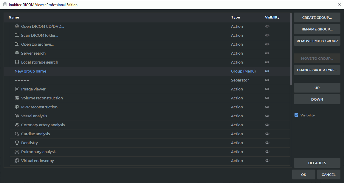
The toolbar settings dialog (Fig. 1.13) shows the current structure of the selected toolbar. The left part of the dialog contains a tree of elements: individual commands, separators, spaces, and user-defined groups. Each element is displayed with its name, type, and visibility status. Visible elements are displayed on the toolbar, while hidden elements — are not.
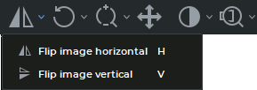
The order of elements in the settings dialog corresponds to their order on the toolbar from left to right. Top-level elements are displayed on the toolbar as individual buttons or separators. Elements placed in a group are arranged according to the group type: they are displayed along the toolbar, grouped using separators (Fig. 1.14), or appear within a button with a drop-down menu (Fig. 1.15).

The right part of the dialog contains commands for changing the toolbar structure. These commands allow you to:
-
create a new user-defined group of elements by clicking the CREATE GROUP... button. In the dialog that opens, enter a group name and select the type of user-defined group:
- Menu — the group is displayed on the toolbar as a button with a drop-down menu. Elements placed in this group are available from the drop-down list of this button;
- Separator — the group elements are displayed along the toolbar in the order specified by the user and grouped using separators.
- rename the selected user-defined group by clicking the RENAME GROUP... button. In the dialog that opens, enter a new group name;
- delete the selected empty user-defined group by clicking the REMOVE EMPTY GROUP button. In the dialog that opens, confirm or cancel deletion of the group;
- move the selected element to a group by clicking the MOVE TO GROUP... button. In the dialog that opens, select the destination group from the drop-down list;
- change the type of a user-defined group by clicking the CHANGE GROUP TYPE... button. In the dialog that opens, select the type of user-defined group: a separator on the toolbar or a button with a drop-down menu;
- move the selected element up or down the list;
- show or hide individual toolbar elements by clicking the button in the Visibility column next to the selected list element or by changing the state of the Visibility checkbox. If a tool button is hidden when customizing the toolbar, the tool itself remains available. It can be activated in other ways: from the main menu of the active tab, from the context menu, or using the assigned hotkey;
- restore the default toolbar settings by clicking the DEFAULTS button.
Click OK to apply the changes. To close the dialog without applying the changes, click CANCEL.
 | If the toolbar is edited in one of several open tabs of the same type, the changes apply only to the current tab. When the toolbar settings dialog is subsequently opened in another tab of the same type, it loads the last saved configuration resulting from the edits made in the previous tab. |
The toolbar settings are saved and restored on subsequent launches of the DICOM Viewer.
| | Customization restrictions may apply to some toolbar elements. For example, certain elements cannot be moved to another group, removed from their original group, or moved from a fixed position. For details, see Section 1.4.3. |
1.4.2 Context Menu Settings
The DICOM Viewer allows you to customize the contents of the context menu of the current tab, if this feature is available for the tab. To open the settings dialog, select View->ontext menu... from the main menu.
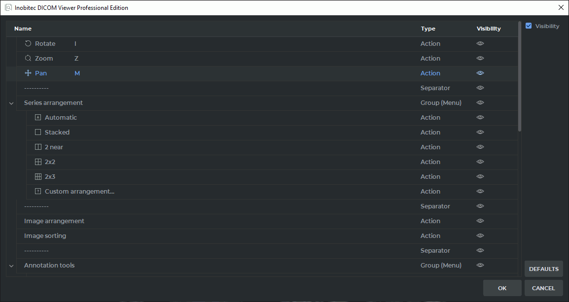
The context menu settings dialog (Fig. 1.16) is organized similarly to the toolbar settings dialog described in Subsection 1.4.1. The left part of the dialog lists the commands available for the context menu of the current tab. Each command is displayed with its name, type, and visibility status.
Unlike the toolbar, the context menu can be customized only by showing or hiding individual commands. Creating user-defined groups, changing group types, and moving elements between groups are not supported for the context menu.
The order of elements in the settings dialog corresponds to their order in the context menu from top to bottom.
Click OK to apply the changes. To close the dialog without applying the changes, click CANCEL. To restore the default context menu settings, click the DEFAULTS button.
The context menu settings are saved and restored on subsequent launches of the DICOM Viewer.
1.4.3 Toolbar Customization Restrictions
Customization options may be limited for some controls. These restrictions are necessary to ensure that the tab and the standard tool groups function correctly.
The following restrictions apply when customizing the toolbar and context menu:
- standard groups cannot be deleted;
- a user-defined group can be deleted only if it contains no elements;
- standard separators and spaces cannot be moved into or out of groups;
- groups cannot be placed inside other groups;
- the contents of some standard groups cannot be changed;
- certain elements always remain at fixed positions on the toolbar;
- some complex controls cannot be placed inside a group.
Additional restrictions apply to certain controls:
- the group of buttons for visualization settings and color table selection cannot be moved. These buttons always remain at the far right of the toolbar;
- the PACS server selection panel in the study list tab cannot be moved. It always remains at the far right of the toolbar;
- the contents of the standard Flip, Projection, and Calcium scoring groups cannot be changed;
- the contents of the Render mode and Navigation mode groups in the MPR reconstruction tab and related tabs, and of the Image mode and Layout groups in the PET analysis tab, cannot be changed;
- the Page number, Page template select, Resolution (dpi), Printer, and Zoom factor elements in the print preview tab cannot be moved into a group.
If an action is unavailable for the selected element, the corresponding command in the settings dialog is either hidden or disabled.


